simple, unique, memorable and yours
Logo and icon design is a passion - the challenge of crafting something simple, unique and memorable while sending out subtle clues of a company's history, service, product or vision, is an absolute joy.
"The cooperation worked great and Craig immediately responded to our wishes. We really like the logo. Thanks again" Daniel - SUB Göttingen
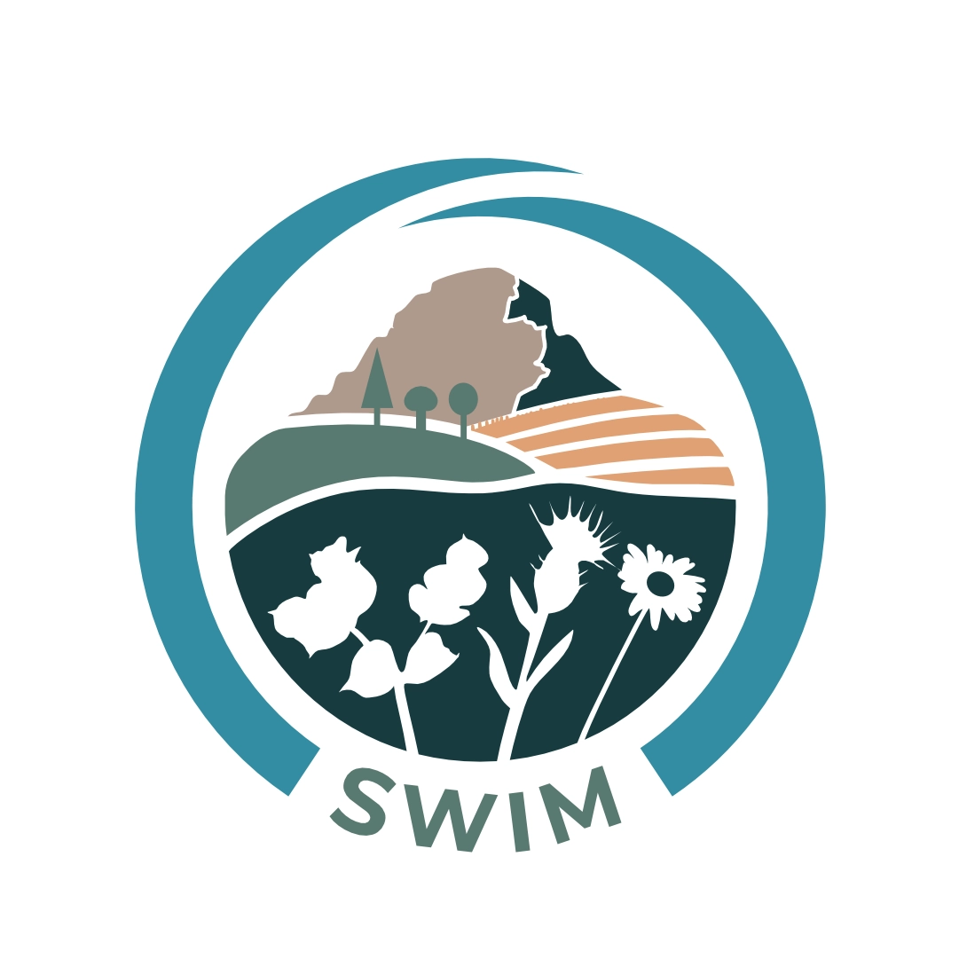
"Thanks again for the logo! Everyone is really happy with it." Megan - SWIM


IRMa logo
Through early discussions with Daniel about the project, the theme of 'threes' stood out for me: 3 keywords in the name, 3-year project, and 3 partner organisations. Through rapid sketching I saw that I could tie this theme with a metadata icon of 3 linked squares and 3 points at the top of the M. The colours come from a mix of the main partners. More subtly, inside the negative space of the R and a is a speech bubble representing the call and response nature of searching repositories. These two speech bubbles sit nicely on either side of the Metadata M.
Get Somerset Cycling
Get Somerset Cycling is the name of campaign funded by the Hinkley Point C project and organised by Life Cycle UK. The logo was part of a larger identity project so it needed to be flexible to fit within Life Cycle UK's identity, but also have its own thing going on. A sign painted style font and warm yellow nod towards Somerset vibes. The circle progressing towards the bike hints at the idea of the campaign.
SWIM logo
South West Invasive Managers are a non profit tackling invasive species of plants in South West Alberta. Megan wanted a logo that could incorporate in which they operate, the name and SWIM acronym. Long names work best as circular logos, so I started there and used my research into SW Alberta landmarks, the invasive plants SWIM manage and typical landscapes they operate in to put together the mountain-to-lake landscape icon. This is headed by the iconic Mt Crowfoot surrounded by a subtle archway of the hands that care for it coming out of the SWIM acronym.
The following logos are just for fun and inspired by local companies I walk by that I would love to see refresh their brand identities. More stories behind these logos can be found over on my instagram.